# tables and graphs
library(questionr)
library(ggsci)
library(ggrain)
library(scales)

# descriptive statistics
library(dlookr)
library(EnvStats)
library(modeest)
library(MESS)
library(descriptr)

# data transformation
library(here)
library(tidyverse)16 Descriptive statistics
Descriptive statistics are used to describe and organize the basic characteristics of the data in a study. The classical descriptive statistics allow us to have a quick glance of the central tendency and the extent of dispersion of values. They are useful in understanding the data distributions and comparing them.
When we have finished this Chapter, we should be able to:
16.1 Packages we need
We need to load the following packages:
16.2 Importing the data
We will use the dataset named arrhythmia which is a .xlsx file. It is supposed that we work with RStudio Projects and the dataset is stored in the subfolder with the name “data” inside the RStudio Project folder. If this is the case, we can read the data using a relative path with the following code:
library(readxl)
arrhythmia <- read_excel(here("data", "arrhythmia.xlsx"))We take a look at the data:
glimpse(arrhythmia)Rows: 428
Columns: 8
$ age <dbl> 75, 56, 54, 55, NA, 40, 49, 44, 50, 62, 45, 54, 30, 44, 47, 47…
$ sex <chr> "male", "female", "male", "male", "male", "female", "female", …
$ height <dbl> 190, 165, 172, 175, 190, 160, 162, 168, 167, 170, 165, 172, 17…
$ weight <dbl> 80, 64, 95, 94, 80, 52, 54, 56, 67, 72, 86, 58, 73, 88, 48, 59…
$ QRS <dbl> 91, 81, 138, 115, 88, 77, 78, 84, 89, 152, 77, 78, 133, 77, 75…
$ HR <dbl> 63, 53, 75, 71, 75, 70, 67, 64, 63, 70, 72, 73, 56, 72, 76, 67…
$ bmi <dbl> 22.2, 23.5, 32.1, 30.7, 22.2, 20.3, 20.6, 19.8, 24.0, 24.9, 31…
$ bmi_cat <chr> "normal", "normal", "obese", "obese", "normal", "normal", "nor…Additionally, we can get some basic summary measures for each variable:
summary(arrhythmia) age sex height weight
Min. :18.00 Length:428 Min. :146 Min. : 18.0
1st Qu.:38.00 Class :character 1st Qu.:160 1st Qu.: 60.0
Median :48.00 Mode :character Median :165 Median : 70.0
Mean :48.67 Mean :165 Mean : 70.1
3rd Qu.:59.00 3rd Qu.:170 3rd Qu.: 80.0
Max. :83.00 Max. :190 Max. :176.0
NA's :3
QRS HR bmi bmi_cat
Min. : 55.00 Min. : 44.00 Min. : 5.20 Length:428
1st Qu.: 80.00 1st Qu.: 65.00 1st Qu.:22.90 Class :character
Median : 87.00 Median : 72.00 Median :25.40 Mode :character
Mean : 91.79 Mean : 73.55 Mean :25.72
3rd Qu.: 96.00 3rd Qu.: 80.00 3rd Qu.:28.10
Max. :178.00 Max. :152.00 Max. :61.60
The data set arrhythmia has 428 patients (rows) and includes 8 variables (columns) as follows:
- age: age (yrs)
- sex: sex (male, female)
- height: height (cm)
- weight: weight (kg)
- QRS: mean duration of QRS (ms)
- HR: heart rate (beats/min)
- bmi
- bmi_cat (4 levels: underweight, normal, overweight, obese)
We might have noticed that the categorical variables sex and bmi_cat are recognized of character <chr> type. We can use the factor() function inside the mutate() to convert the variables to factors as follows:
arrhythmia <- arrhythmia |>
  mutate(sex = factor(sex),
         bmi_cat = factor(bmi_cat, levels = c("underweight", "normal",
                                              "overweight", "obese")))
Let’s look at the data again with the glipmse() function:
glimpse(arrhythmia)Rows: 428
Columns: 8
$ age <dbl> 75, 56, 54, 55, NA, 40, 49, 44, 50, 62, 45, 54, 30, 44, 47, 47…
$ sex <fct> male, female, male, male, male, female, female, male, female, …
$ height <dbl> 190, 165, 172, 175, 190, 160, 162, 168, 167, 170, 165, 172, 17…
$ weight <dbl> 80, 64, 95, 94, 80, 52, 54, 56, 67, 72, 86, 58, 73, 88, 48, 59…
$ QRS <dbl> 91, 81, 138, 115, 88, 77, 78, 84, 89, 152, 77, 78, 133, 77, 75…
$ HR <dbl> 63, 53, 75, 71, 75, 70, 67, 64, 63, 70, 72, 73, 56, 72, 76, 67…
$ bmi <dbl> 22.2, 23.5, 32.1, 30.7, 22.2, 20.3, 20.6, 19.8, 24.0, 24.9, 31…
$ bmi_cat <fct> normal, normal, obese, obese, normal, normal, normal, normal, …Now, both variables, sex and bmi_cat, have become factors with levels.
16.3 Summarizing Categorical Data (Frequency Statistics)
The first step to analyze categorical data is to count the different types of labels and calculate the frequencies. The set of frequencies of all the possible categories is called the frequency distribution of the variable. Additionally, we can express the frequencies as proportions of the total sample size (relative frequencies, %).
We can generate a frequency table for the sex variable using the freq() function from the {questionr} package:
freq(arrhythmia$sex, cum = T, total = T, valid = F) n % %cum
female 237 55.4 55.4
male 191 44.6 100.0
Total 428 100.0 100.0The table shows the number of patients (n) in each category (absolute frequency), the percentage (%) contribution of each category to the total (relative frequency), and the commutative percentage (%cum). Of note, the percentages add up to 100%.
Similarly, we can create the frequency table for the bmi_cat variable:
freq(arrhythmia$bmi_cat, cum = T, total = T, valid = F) n % %cum
underweight 11 2.6 2.6
normal 192 44.9 47.4
overweight 167 39.0 86.4
obese 58 13.6 100.0
Total 428 100.0 100.0
We can also sort the BMI categories in a decreasing order of frequencies:
freq(arrhythmia$bmi_cat, cum = T, total = T, valid = F, sort = "dec") n % %cum
normal 192 44.9 44.9
overweight 167 39.0 83.9
obese 58 13.6 97.4
underweight 11 2.6 100.0
Total 428 100.0 100.0In the above table we observe that a large proportion of patients are overweight (167 out of 428, 39.0%).
In addition to tabulating each variable separately, we might be interested in whether the distribution of patients across each sex is different for each BMI category.
tab <- table(arrhythmia$sex, arrhythmia$bmi_cat)
rprop(tab, percent = T, total = F, n = T)
         underweight normal overweight obese  n
  female   3.0%       48.5%  32.1%      16.5% 237
  male     2.1%       40.3%  47.6%       9.9% 191
We can see that the percentage of overweight male patients (47.6%) is higher than overweight female patients (32.1%). In contrast, the percentage of obese male patients (9.9%) is lower than obese female patients (16.5%).
16.4 Displaying Categorical Data
While frequency tables are extremely useful, the best way to investigate a dataset is to plot it. For categorical variables, such as sex and bmi_cat, it is straightforward to present the number in each category, usually indicating the frequency and percentage of the total number of patients. When shown graphically this is called a bar plot.
A. Simple Bar Plot
A simple bar plot is an easy way to make comparisons across categories. Figure 16.2 shows the BMI categories for 428 patients. Along the horizontal axis (x-axis) are the different BMI categories whilst on the vertical axis (y-axis) is the percentage (%). The height of each bar represents the percentage of the total patients in that category. For example, it can be seen that the percentage of overweight participants is 39% (167/428).
# create a data frame with ordered BMI categories and their counts
dat1 <- arrhythmia |>
  count(bmi_cat) |>
  mutate(pct = round_percent(n, 1))

# plot the data
ggplot(dat1, aes(x = bmi_cat, y = pct)) +
  geom_col(width=0.65, fill = "steelblue4") +
  geom_text(aes(label=paste0(pct, "%")),
            vjust=1.6, color = "white", size = 7) +
  labs(x = "BMI category", y = "Percent",
       caption = "Number of patients: 428") +
  scale_y_continuous(labels = scales::percent_format(scale = 1)) +
  theme_minimal(base_size = 20)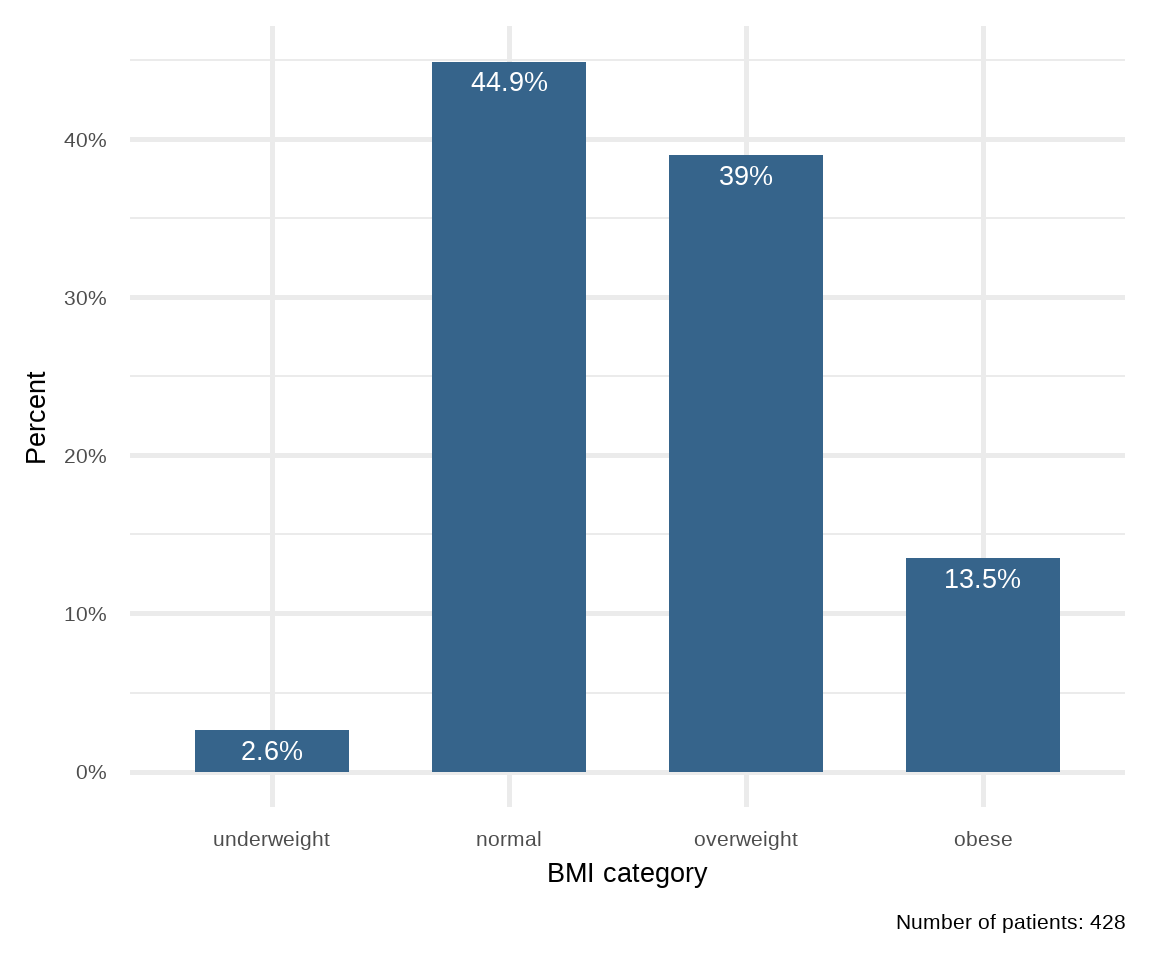
B. Side-by-side and Grouped Bar Plots
If the data are further classified into whether the patient was male or female then it becomes impossible to present this information to a single bar plot. In this case, we can present the data as a side-by-side bar plot (Figure 16.3) or, even better, as a grouped bar plot to make the visual comparisons easier (Figure 16.4).
# create a data frame with ordered BMI categories and their counts by sex
dat2 <- arrhythmia |>
  count(bmi_cat, sex) |>
  group_by(sex) |>
  mutate(pct = round_percent(n, 1)) |>
  ungroup()

ggplot(dat2) +
  geom_col(aes(bmi_cat, pct, fill = sex), width=0.7, position = "dodge") +
  geom_text(aes(bmi_cat, pct, label = paste0(pct, "%"),
                group = sex), color = "white", size = 7, vjust=1.2,
            position = position_dodge(width = .9)) +
  labs(x = "BMI category", y = "Percent",
       caption = "female: n=237, male: n=191") +
  scale_y_continuous(labels = scales::percent_format(scale = 1)) +
  scale_fill_jco() +
  theme_minimal(base_size = 20) +
  theme(legend.position="none",
        axis.text.x = element_text(angle = 45, hjust = 1)) +
  facet_wrap(~sex, ncol = 2)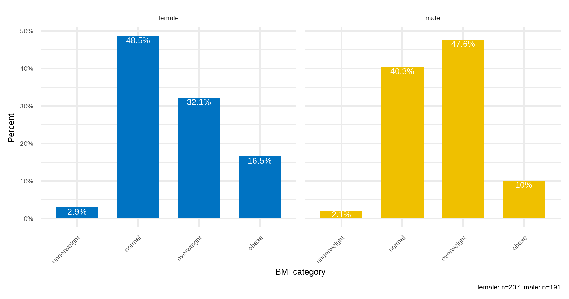
ggplot(dat2) +
  geom_col(aes(bmi_cat, pct, fill = sex), width = 0.8, position = "dodge") +
  geom_text(aes(bmi_cat, pct, label = paste0(pct, "%"),
                group = sex), color = "white", size = 7, vjust=1.2,
            position = position_dodge(width = .9)) +
  labs(x = "BMI category", y = "Percent",
       caption = "female: n=237, male: n=191") +
  scale_y_continuous(labels = scales::percent_format(scale = 1)) +
  scale_fill_jco() +
  theme_minimal(base_size = 20)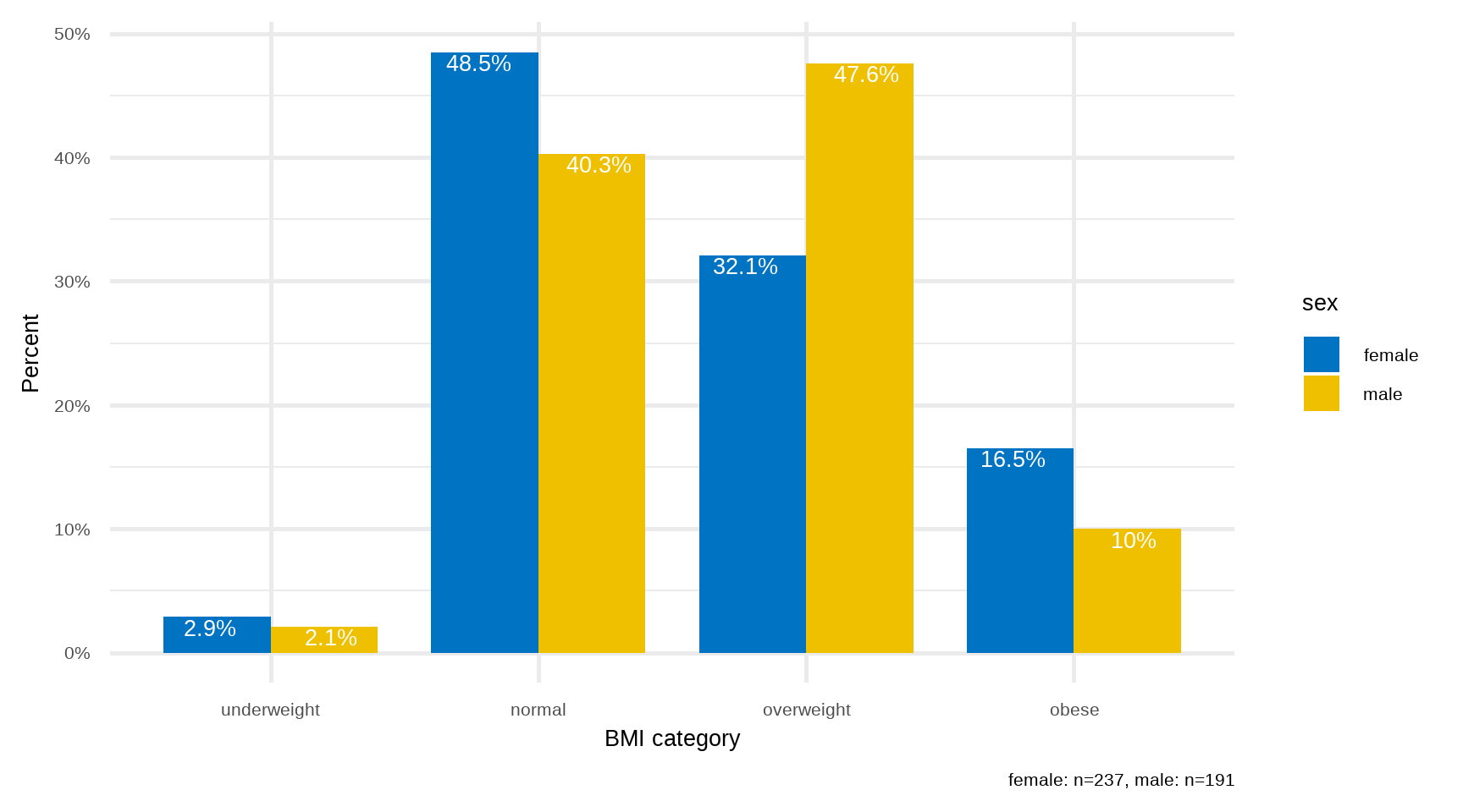
C. Stacked Bar Plot
Unlike side-by-side or grouped bar plots, stacked bar plots segment their bars. A 100% Stack Bar Plot shows the percentage-of-the-whole of each group. This makes it easier to see if relative differences exist between quantities in each group (Figure 16.5).
# create a data frame with ordered BMI categories and their counts by sex
dat3 <- arrhythmia |>
  group_by(sex) |>
  count(bmi_cat) |>
  mutate(pct = round_percent(n, 2)) |>
  ungroup()

ggplot(dat3, aes(x = sex, y = pct, fill = forcats::fct_rev(bmi_cat)))+
  geom_bar(stat = "identity", width = 0.8)+
  geom_text(aes(label = paste0(round(pct, 1), "%"), y = pct), size = 6,
            position = position_stack(vjust = 0.5)) +
  coord_flip()+
  scale_fill_simpsons() +
  scale_y_continuous(labels = scales::percent_format(scale = 1))+
  labs(x = "Sex", y = "Percent", fill = "BMI category") +
  theme_minimal(base_size = 20)
Stacked bar plots tend to become confusing when the variable has many levels
One issue to consider when using stacked bar plots is the number of variable levels: when dealing with many categories, stacked bar plots tend to become rather confusing.
16.5 Summarizing Numerical Data
Summary measures are single numerical values that summarize a large number of values. Numeric data are described with two main types of summary measures (Table 16.1):
measures of central location (where the center of the distribution of the values in a variable is located)
measures of dispersion (how widely the values are spread above and below the central value)
| Measures of central location | Measures of dispersion |
|---|---|
|
|
16.6 Summary statistics
16.6.1 Measures of central location
A. Sample Mean or Average
Advantages of mean
- It uses all the data values in the calculation.
- It is algebraically defined and thus mathematically manageable.
Disadvantages of mean
- It is highly affected by the presence of a few abnormally high or abnormally low values (outliers), so it is not an appropriate average for highly skewed (asymmetrical) distributions.
- It can not be determined easily by inspection of the data.
Let
Let’s calculate the sample mean of age variable in our dataset:
Sample mean of age
mean(arrhythmia$age, na.rm = TRUE)[1] 48.67059arrhythmia |>
summarise(mean = mean(age, na.rm = TRUE))# A tibble: 1 × 1
mean
<dbl>
1 48.7B. Median of the sample
The sample median, md, is an alternative measure of location, which is less sensitive to outliers. The median is calculated by first sorting the observed values (i.e. arranging them in an ascending/descending order) and selecting the middle one. If the sample size n is odd, the median is the number at the middle of the ordered observations. If the sample size is even, the median is the average of the two middle numbers.
Advantage of sample median
- It is not affected by outliers.
Disadvantage of sample median
- It does not take into account the precise value of each observation and hence does not use all the information available in the data.
Therefore, the sample median, md, of n observations is:
the
the average of the
Sample median of age
median(arrhythmia$age, na.rm = TRUE)[1] 48arrhythmia |>
summarise(median = median(age, na.rm = TRUE))# A tibble: 1 × 1
median
<dbl>
1 48C. Mode of the sample
A third measure of location is the mode. This is the value that occurs most frequently in a set of data values. Note that some dataset do not have a mode because each value occurs only once.
NOTE: When a distribution has to modes (peaks) is called Bimodal distribution. This can be caused by mixing two populations together. For example, height might appear to have a bimodal distribution if men and women are included in the study.
Base R does not provide a function for calculating the mode of a numeric variable. However, we can download the package called {modeest} and use the mlv() function specifying the method as "mfv". This method returns the most frequent value(s):
mlv(arrhythmia$age, method = "mfv", na.rm = TRUE)[1] 4716.6.2 Measures of Dispersion
A. Sample Variance
Sample variance,
Sample variance of age
var(arrhythmia$age, na.rm = TRUE)[1] 199.4243arrhythmia |>
summarise(variance = var(age, na.rm = TRUE))# A tibble: 1 × 1
variance
<dbl>
1 199.The variance is expressed in square units, so it is not suitable measure for describing variability of data.
B. Standard deviation of the sample
Standard deviation (denoted as sd or s) of a data set is the square root of the sample variance:
Standard deviation of age
sd(arrhythmia$age, na.rm = TRUE)[1] 14.12177arrhythmia |>
summarise(standard_deviation = sd(age, na.rm = TRUE))# A tibble: 1 × 1
standard_deviation
<dbl>
1 14.1Standard deviation is expressed in the same units as the original values.
C. Range of the sample
The Range is the difference between the minimum (lowest) and maximum (highest) values. In R, the range() function returns a vector containing the minimum and maximum values:
One disadvantage of using range as a measure of dispersion is its sensitivity to outliers.
range(arrhythmia$age, na.rm = TRUE)[1] 18 83The difference between the two values, 83 - 18, is:
diff(range(arrhythmia$age, na.rm = TRUE))[1] 65D. Inter-quartile range of the sample
IQR(arrhythmia$age, na.rm = TRUE)[1] 21quantile(arrhythmia$age, prob=c(0.25, 0.75), na.rm = T, type=1)25% 75%
38 59 Let’s calculate the summary statistics for the age variable in our dataset.
Summary statistics: Variable age
arrhythmia |>
  summarise(
    n = n(),
    na = sum(is.na(age)),
    min = min(age, na.rm = TRUE),
    q1 = quantile(age, 0.25, na.rm = TRUE),
    median = quantile(age, 0.5, na.rm = TRUE),
    q3 = quantile(age, 0.75, na.rm = TRUE),
    max = max(age, na.rm = TRUE),
    mean = mean(age, na.rm = TRUE),
    sd = sd(age, na.rm = TRUE),
    skewness = EnvStats::skewness(age, na.rm = TRUE),
    kurtosis= EnvStats::kurtosis(age, na.rm = TRUE)
  )
# A tibble: 1 × 11
n na min q1 median q3 max mean sd skewness kurtosis
<int> <int> <dbl> <dbl> <dbl> <dbl> <dbl> <dbl> <dbl> <dbl> <dbl>
1 428 3 18 38 48 59 83 48.7 14.1 0.0557 -0.605arrhythmia |>
describe(age) |>
select(described_variables, n, na, mean, sd, p25, p50, p75, skewness, kurtosis)|>
print(width = 100)# A tibble: 1 × 10
described_variables n na mean sd p25 p50 p75 skewness
<chr> <int> <int> <dbl> <dbl> <dbl> <dbl> <dbl> <dbl>
1 age 425 3 48.7 14.1 38 48 59 0.0557
kurtosis
<dbl>
1 -0.605arrhythmia |>
ds_tidy_stats(age) |>
print(width = 100)# A tibble: 1 × 16
vars min max mean t_mean median mode range variance stdev skew
<chr> <dbl> <dbl> <dbl> <dbl> <dbl> <dbl> <dbl> <dbl> <dbl> <dbl>
1 age 18 83 48.7 48.7 48 47 65 199. 14.1 0.0557
kurtosis coeff_var q1 q3 iqrange
<dbl> <dbl> <dbl> <dbl> <dbl>
1 -0.605 29.0 38 59 21
Summary statistics: Variable QRS
arrhythmia |>
  summarise(
    n = n(),
    na = sum(is.na(QRS)),
    min = min(QRS, na.rm = TRUE),
    q1 = quantile(QRS, 0.25, na.rm = TRUE),
    median = quantile(QRS, 0.5, na.rm = TRUE),
    q3 = quantile(QRS, 0.75, na.rm = TRUE),
    max = max(QRS, na.rm = TRUE),
    mean = mean(QRS, na.rm = TRUE),
    sd = sd(QRS, na.rm = TRUE),
    skewness = EnvStats::skewness(QRS, na.rm = TRUE),
    kurtosis= EnvStats::kurtosis(QRS, na.rm = TRUE)
  )
# A tibble: 1 × 11
n na min q1 median q3 max mean sd skewness kurtosis
<int> <int> <dbl> <dbl> <dbl> <dbl> <dbl> <dbl> <dbl> <dbl> <dbl>
1 428 0 55 80 87 96 178 91.8 19.1 1.88 3.94arrhythmia |>
describe(QRS) |>
select(described_variables, n, na, mean, sd, p25, p50, p75, skewness, kurtosis)|>
print(width = 100)# A tibble: 1 × 10
described_variables n na mean sd p25 p50 p75 skewness
<chr> <int> <int> <dbl> <dbl> <dbl> <dbl> <dbl> <dbl>
1 QRS 428 0 91.8 19.1 80 87 96 1.88
kurtosis
<dbl>
1 3.94
B. Summary statistics by group
Next, we are interested in calculating the summary statistics of the age variable for males and females, separately.
Summary statistics: age stratified by sex
summary_age_sex <- arrhythmia |>
  group_by(sex) |>
  summarise(
    n = n(),
    na = sum(is.na(age)),
    min = min(age, na.rm = TRUE),
    q1 = quantile(age, 0.25, na.rm = TRUE),
    median = quantile(age, 0.5, na.rm = TRUE),
    q3 = quantile(age, 0.75, na.rm = TRUE),
    max = max(age, na.rm = TRUE),
    mean = mean(age, na.rm = TRUE),
    sd = sd(age, na.rm = TRUE),
    skewness = EnvStats::skewness(age, na.rm = TRUE),
    kurtosis= EnvStats::kurtosis(age, na.rm = TRUE)
  ) |>
  ungroup()

summary_age_sex
# A tibble: 2 × 12
sex n na min q1 median q3 max mean sd skewness kurtosis
<fct> <int> <int> <dbl> <dbl> <dbl> <dbl> <dbl> <dbl> <dbl> <dbl> <dbl>
1 fema… 237 2 19 36 47 58.5 83 47.6 14.5 0.163 -0.723
2 male 191 1 18 41 49 59 80 49.9 13.5 -0.0630 -0.343arrhythmia |>
group_by(sex) |>
describe(age) |>
select(described_variables, sex, n, na, mean, sd, p25, p50, p75, skewness, kurtosis) |>
ungroup()|>
print(width = 100)# A tibble: 2 × 11
described_variables sex n na mean sd p25 p50 p75 skewness
<chr> <fct> <int> <int> <dbl> <dbl> <dbl> <dbl> <dbl> <dbl>
1 age female 235 2 47.6 14.5 36 47 58.5 0.163
2 age male 190 1 49.9 13.5 41 49 59 -0.0630
kurtosis
<dbl>
1 -0.723
2 -0.343If we want to save our descriptive statistics, calculated in R, we can use the write_xlsx() function from {writexl} package. In the example below, we are saving the summary_age_sex table to a .xlsx file in the data folder of our RStudio Project:
library(writexl)
write_xlsx(summary_age_sex, here("data", "summary_age_sex.xlsx"))
Summary statistics: QRS stratified by sex
arrhythmia |>
  group_by(sex) |>
  summarise(
    n = n(),
    na = sum(is.na(QRS)),
    min = min(QRS, na.rm = TRUE),
    q1 = quantile(QRS, 0.25, na.rm = TRUE),
    median = quantile(QRS, 0.5, na.rm = TRUE),
    q3 = quantile(QRS, 0.75, na.rm = TRUE),
    max = max(QRS, na.rm = TRUE),
    mean = mean(QRS, na.rm = TRUE),
    sd = sd(QRS, na.rm = TRUE),
    skewness = EnvStats::skewness(QRS, na.rm = TRUE),
    kurtosis= EnvStats::kurtosis(QRS, na.rm = TRUE)
  ) |>
  ungroup()
# A tibble: 2 × 12
sex n na min q1 median q3 max mean sd skewness kurtosis
<fct> <int> <int> <dbl> <dbl> <dbl> <dbl> <dbl> <dbl> <dbl> <dbl> <dbl>
1 fema… 237 0 55 77 82 90 163 86.4 17.2 2.22 5.65
2 male 191 0 71 87 92 102. 178 98.5 19.4 1.92 3.65arrhythmia |>
group_by(sex) |>
describe(QRS) |>
select(described_variables, sex, n, na, mean, sd, p25, p50, p75, skewness, kurtosis) |>
ungroup() |>
print(width = 100)# A tibble: 2 × 11
described_variables sex n na mean sd p25 p50 p75 skewness
<chr> <fct> <int> <int> <dbl> <dbl> <dbl> <dbl> <dbl> <dbl>
1 QRS female 237 0 86.4 17.2 77 82 90 2.22
2 QRS male 191 0 98.5 19.4 87 92 102. 1.92
kurtosis
<dbl>
1 5.65
2 3.65
16.7 Displaying Numerical Data
A. Histogram / Density plot
The most common way of presenting a frequency distribution of a continuous variable is a histogram. Histograms (Figure 16.6) depict the distribution of the data as a series of bars without space between them. Each bar typically covers a range of numeric values called a bin; a bar’s height indicates the frequency of observations with a value within the corresponding bin.
# Histogram of age
ggplot(arrhythmia, aes(x = age)) +
  geom_histogram(binwidth = 8, fill = "steelblue4",
                 color = "#8fb4d9", alpha = 0.6) +
  theme_minimal(base_size = 20) +
  labs(title = "Histogram: age", y = "Frequency")

# Histogram of QRS
ggplot(arrhythmia, aes(x = QRS)) +
  geom_histogram(binwidth = 8, fill = "steelblue4",
                 color = "#8fb4d9", alpha = 0.6) +
  theme_minimal(base_size = 20) +
  labs(title = "Histogram: QRS", y = "Frequency")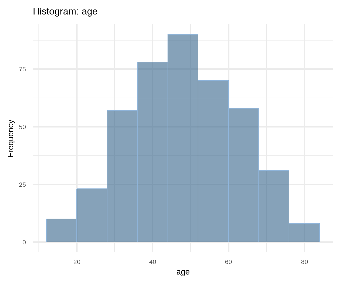
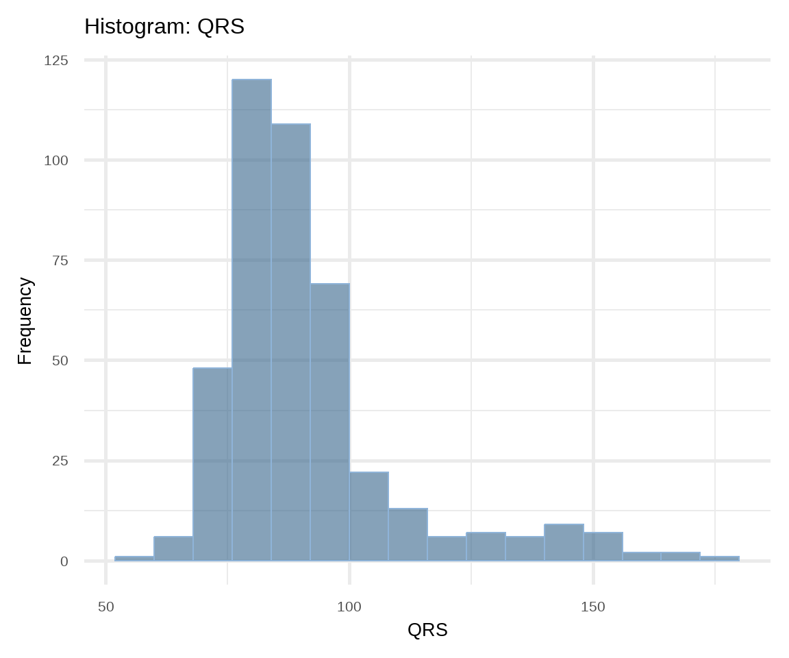
A histogram gives information about:
- How the data are distributed (symmetrical or asymmetrical) and if there are any outliers.
- Where the peak (or peaks) of the distribution is.
- The amount of variability in the data.
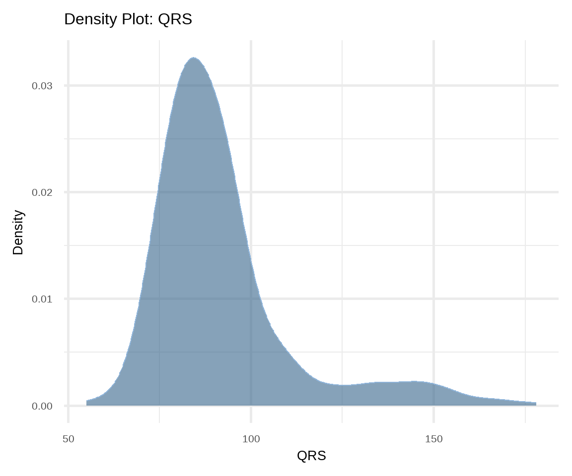
Density plot is also used to present the distribution of a continuous variable and it is considered a variation of the histogram allowing for smoother distributions1 (Figure 16.7). In this case, geom_density() function is used for displaying the distribution.
1 Density curves are usually scaled such that the area under the curve equals one.
# density plot of age
ggplot(arrhythmia, aes(x = age)) +
  geom_density(fill="steelblue4", color="#8fb4d9",
               adjust = 1.5, alpha=0.6) +
  theme_minimal(base_size = 20) +
  labs(title = "Density Plot: age", y = "Density")

# density plot of QRS
ggplot(arrhythmia, aes(x = QRS)) +
  geom_density(fill="steelblue4", color="#8fb4d9",
               adjust = 1.5, alpha=0.6) +
  theme_minimal(base_size = 20) +
  labs(title = "Density Plot: QRS", y = "Density")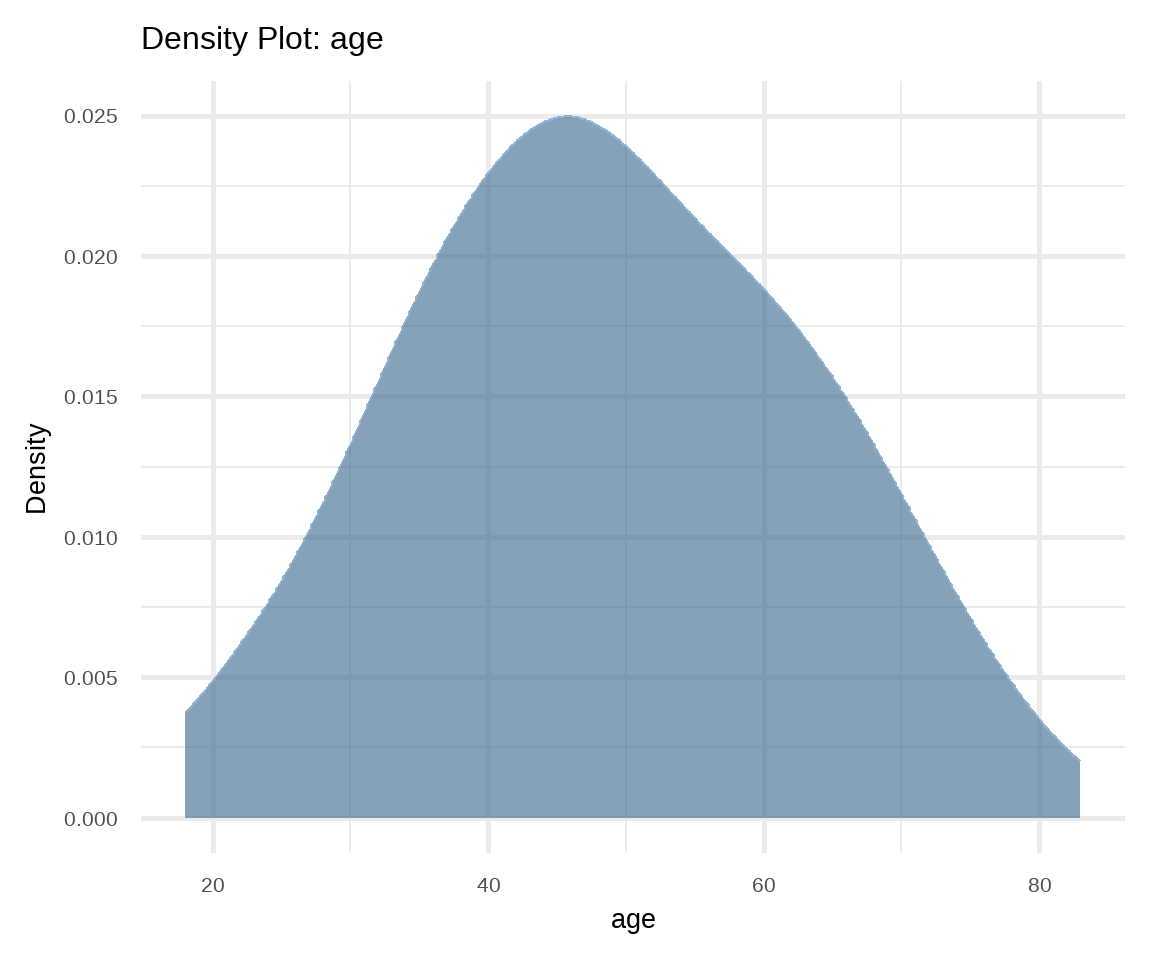
B. Box Plot
Box plots can be used for displaying location and dispersion for continuous data, particularly when comparing distributions between many groups (Figure 16.8). This type of graph uses boxes and lines to depict the distributions. Box limits indicate the range of the central 50% of the data, with a horizontal line in the box corresponding to the median. Whiskers extend from each box to capture the range of the remaining data. Data points that are outside the whiskers are represented as dots on the graph and considered potential outliers.2
2 An outlier is an observation that is significantly distant from the main body the data. We say any value outside of the following interval is an outlier:
# box plot of age stratified by sex
ggplot(arrhythmia, aes(x = sex, y = age, fill = sex)) +
  geom_boxplot(alpha = 0.6, width = 0.5) +
  theme_minimal(base_size = 20) +
  labs(title = "Grouped Box Plot: age by sex") +
  scale_fill_jco() +
  theme(legend.position = "none")

# box plot of QRS stratified by sex
ggplot(arrhythmia, aes(x = sex, y = QRS, fill = sex)) +
  geom_boxplot(alpha = 0.6, width = 0.5) +
  theme_minimal(base_size = 20) +
  labs(title = "Grouped Box Plot: QRS by sex") +
  scale_fill_jco() +
  theme(legend.position = "none")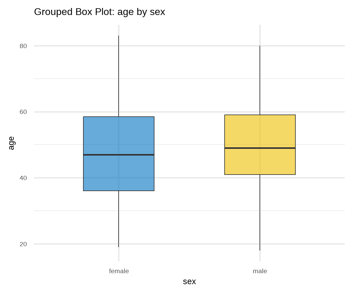
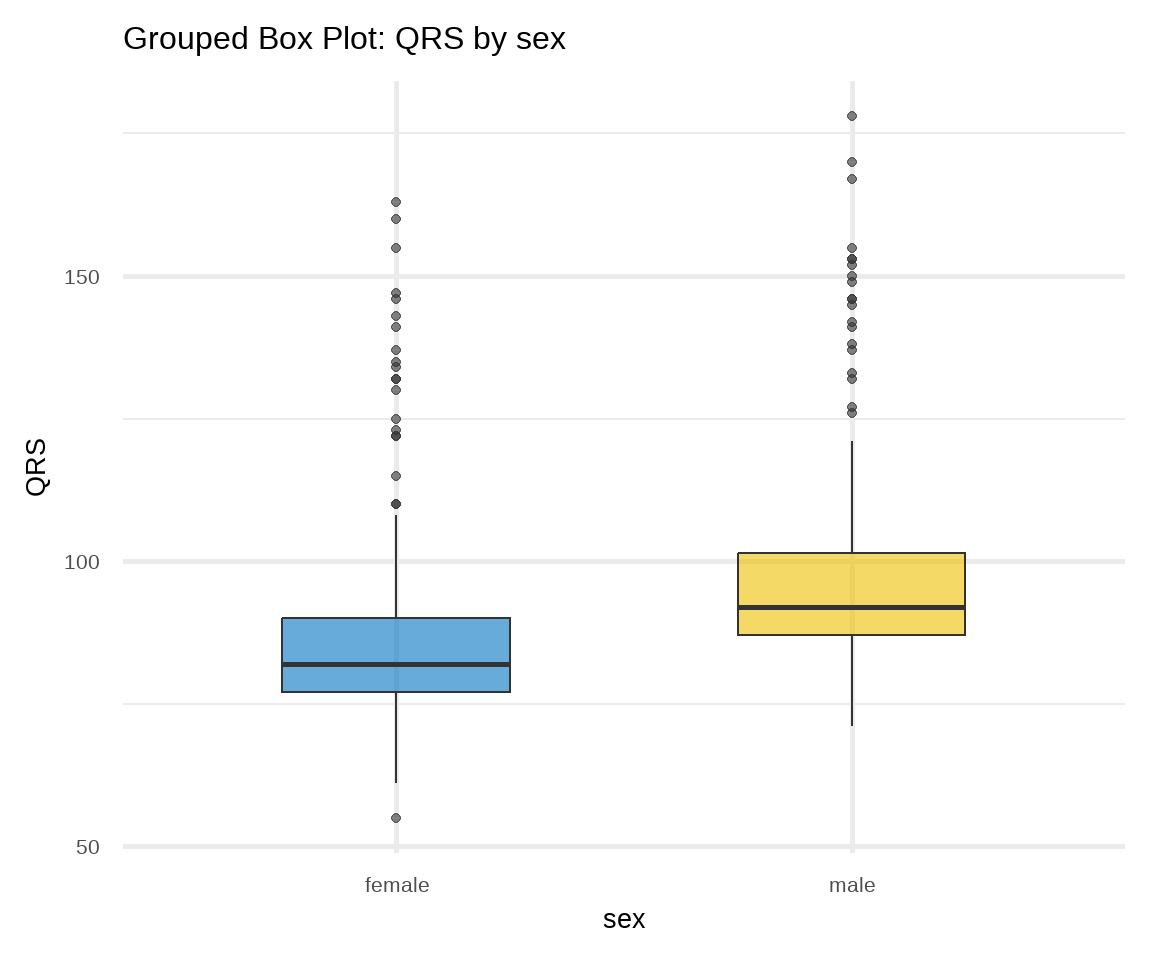
In Figure 16.8 a, box plots of age are approximately symmetric about the median for females and males. On the contrary, in Figure 16.8 b, both distributions of QRS data are positively skewed; the box plots show the medians closer to the lower quartiles (q25) and we observe many outliers at the upper range of the data for females and males.
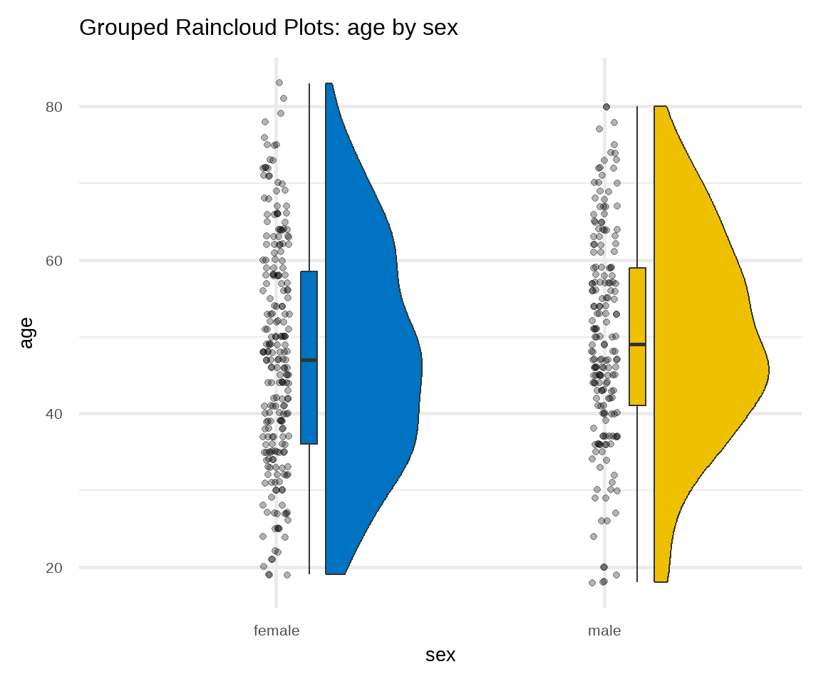
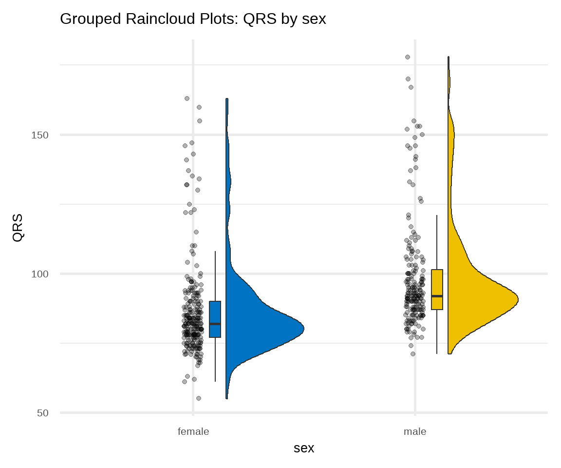
C. Raincloud Plot
There are many variations of the box plot. For example, there is a way to combine raw data (dots), probability density, and key summary statistics such as median, and relevant intervals of a range of likely values for the population parameter, in an appealing and flexible format with minimal redundancy, using the raincloud plot (Figure 16.9):
# raincloud plot of age stratified by sex
ggplot(arrhythmia, aes(sex, age, fill = sex)) +
  geom_rain(likert= TRUE, point.args = list(alpha = .3)) +
  theme_minimal(base_size = 20) +
  labs(title = "Grouped Raincloud Plots: age by sex") +
  scale_fill_jco() +
  theme(legend.position = "none")

# raincloud plot of QRS stratified by sex
ggplot(arrhythmia, aes(sex, QRS, fill = sex)) +
  geom_rain(likert= TRUE, point.args = list(alpha = .3)) +
  theme_minimal(base_size = 20) +
  labs(title = "Grouped Raincloud Plots: QRS by sex") +
  scale_fill_jco() +
  theme(legend.position = "none")